UPLIFT, INC.
Design Systems • DesignOps
Uplift, Inc., headquartered in Sunnyvale, CA, with offices in Toronto, New York, Reno, and Guadalajara, is a leading player in the Buy Now, Pay Later (BNPL) space. The company has built a strong reputation by specializing in point-of-sale financing for the travel industry, partnering with nearly 200 travel brands—including United Airlines, Carnival Cruise, Southwest Airlines, and Expedia. Uplift was recently acquired by Upgrade, Inc.
To support its commitment to design excellence and reduce technical and design debt, Uplift launched a major initiative: building a scalable design system from the ground up for all digital products.
As the Design Systems Lead, I was responsible for establishing and guiding the design systems team. My role included developing design processes, shaping the strategic roadmap, and facilitating sprint rituals. All of this supported the success and adoption of the design system across the organization.
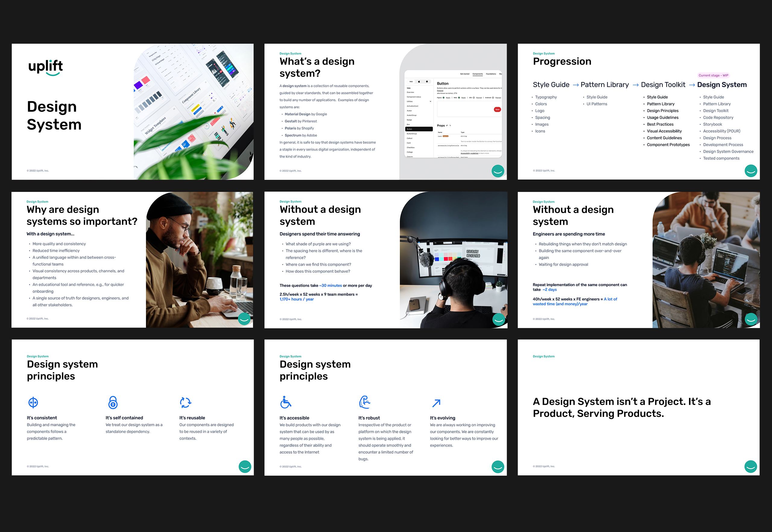
Educating the Team and Securing Buy-In
For a design system to thrive, it's essential to educate key stakeholders so they understand its value and know how to use the right tools effectively. Successfully implementing processes across departments also requires fostering a culture and mindset that aligns with the organization's goals. To support this, I created and delivered tailored presentations for different teams to ensure the message resonated with each audience.
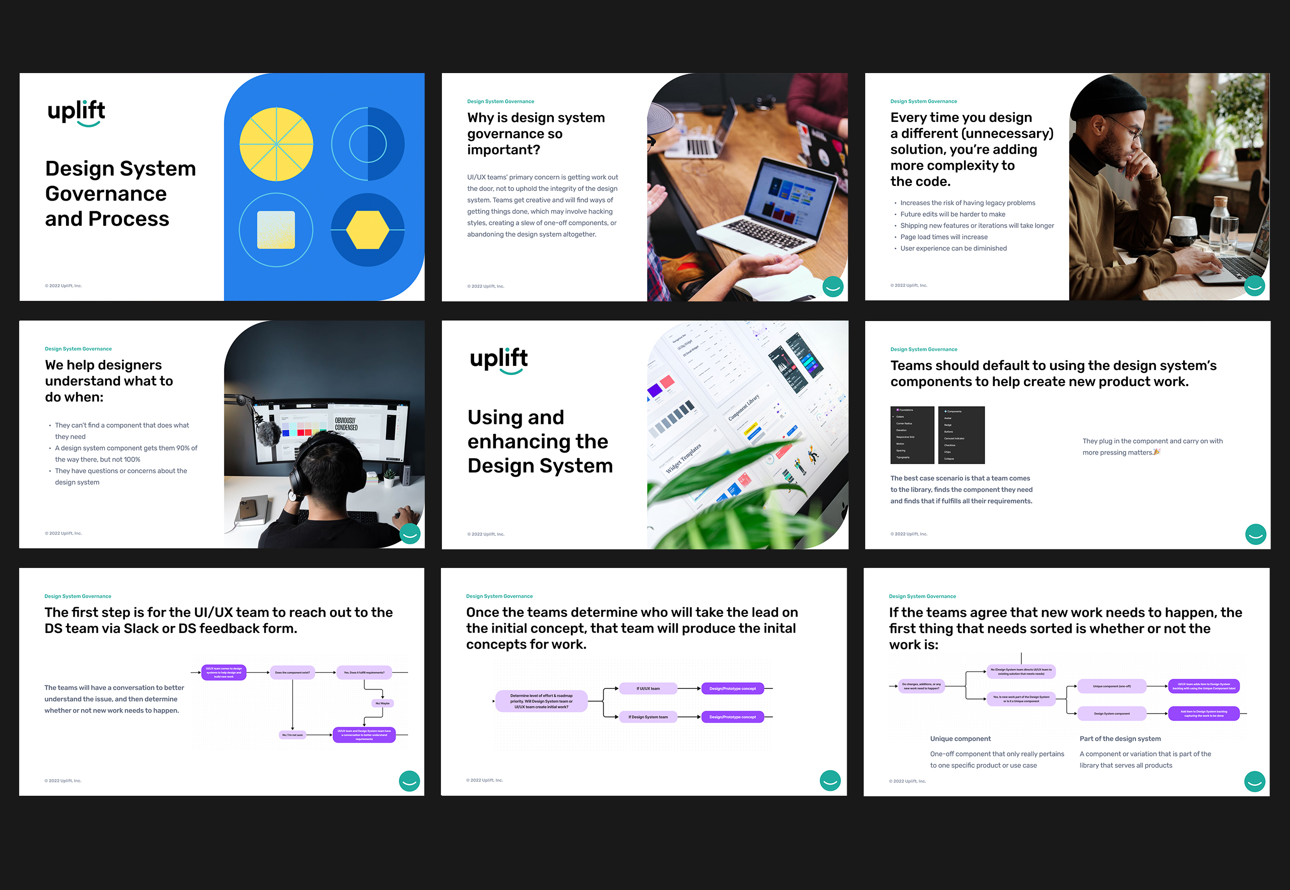
Design System Governance
Governance is a foundational pillar when establishing a design system. It sets clear expectations and guidelines, enabling teams to fully leverage the system’s potential. To ensure success, processes must be thoughtfully designed to support optimization scenarios while aligning seamlessly with workflows across all departments. This alignment is essential for building a design system that is both effective and scalable.
Design Audit
I conducted a comprehensive design audit, systematically evaluating the company’s design assets, guidelines, and processes. This included an in-depth review of all design files to identify redundancies, remove duplicates, and organize components using atomic design principles. The audit helped uncover areas for improvement, streamline workflows, and ensure brand consistency across all touchpoints.
Design System Structure
After identifying all essential elements through the design audit, the success of a design system depends on strong structure and cross-functional collaboration. To support this, I initiate the creation of a shared FigJam board—a central space for collaborative brainstorming between designers and developers. These sessions help surface all necessary components, variants, instances, and content that will form the foundation of the system. I also promote a culture of continuous improvement by encouraging regular Jam sessions, where the team can openly discuss, refine, and evolve system components together.


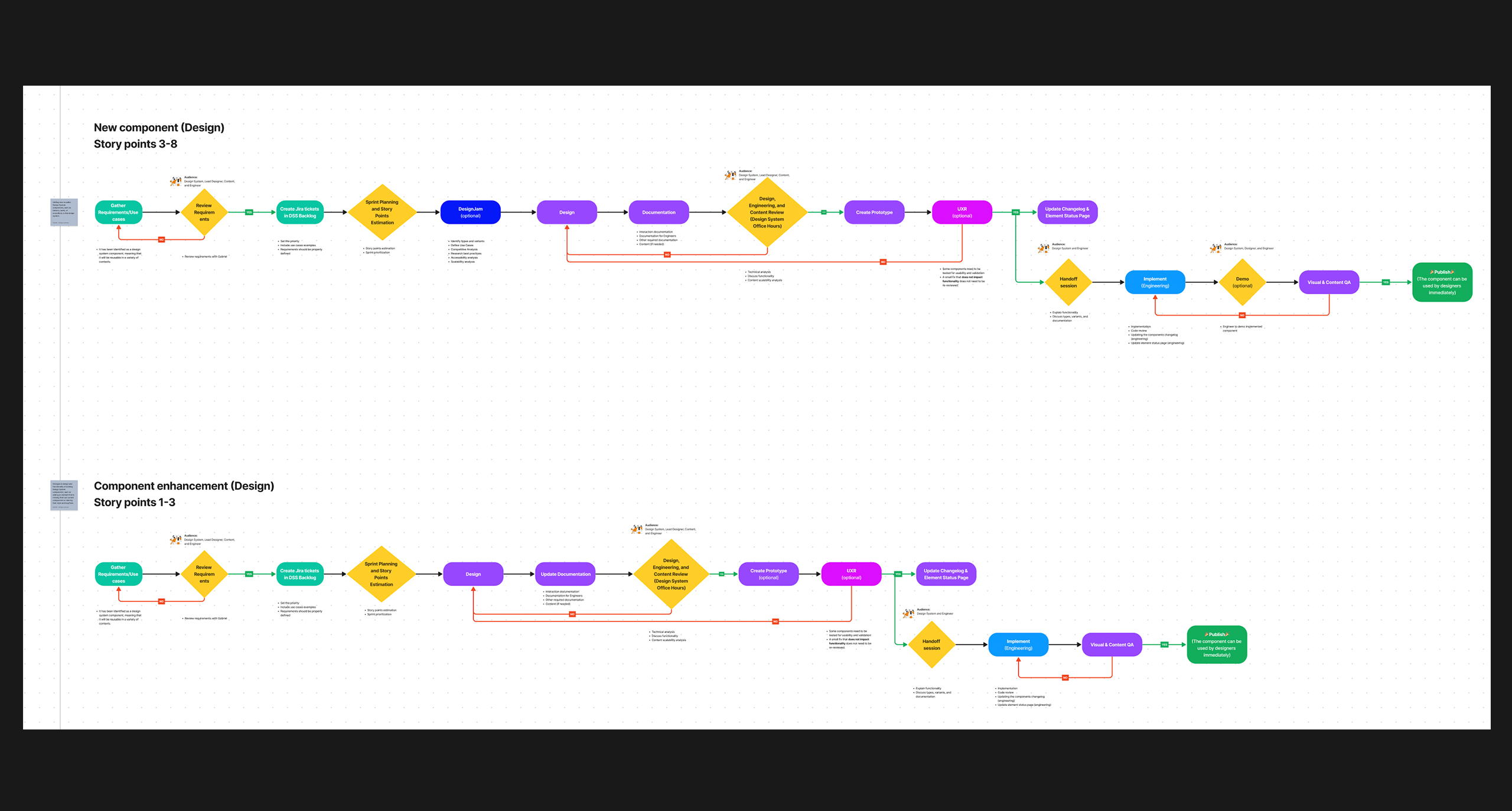
Understanding the Design System Story Points
Before setting up the design system backlog in Jira, it was important to ensure the team could accurately assess the size and complexity of each task. To support this, I introduced key sizing metrics and led training sessions to help the team estimate work more effectively. This approach allows us to systematically track progress, maintain velocity, and generate clear quarterly reports for leadership.

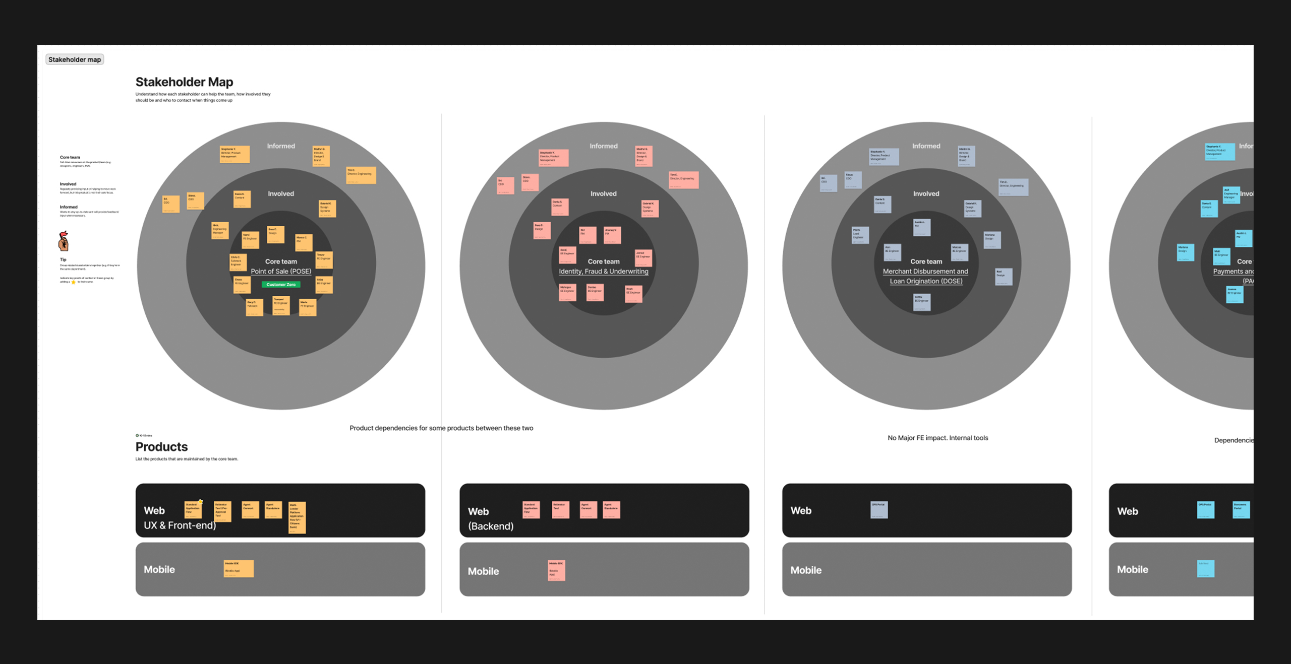
Design System Adoption Plan
A strong adoption plan is essential for the successful implementation of any design system. To ensure seamless integration, I led a collaborative brainstorming session with Product Managers, Design Managers, and Engineering Managers. Together, we aligned on priorities, secured stakeholder buy-in, allocated resources, and identified the first product to adopt the design system—laying the groundwork for broader rollout across the organization.
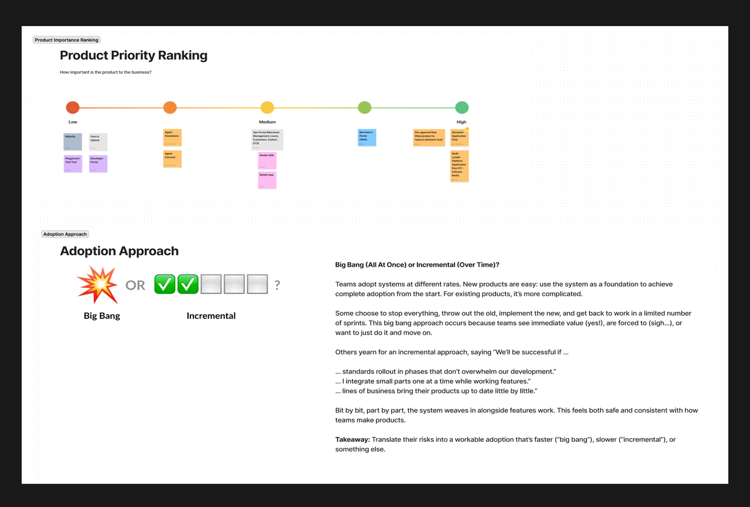
The Design System Team Backlog
With clarity on the first product to adopt the design system, I took the lead in establishing the design system backlog. I populated Jira with prioritized tickets aligned to our roadmap, carefully considering factors like complexity and reusability across products to guide both design and development efforts.
Beyond backlog management, I also facilitate key sprint ceremonies for the design system team—including daily stand-ups, retrospectives, backlog refinement sessions, and dedicated Design System Office Hours. These rituals foster alignment, encourage collaboration, and support continuous improvement across the team.

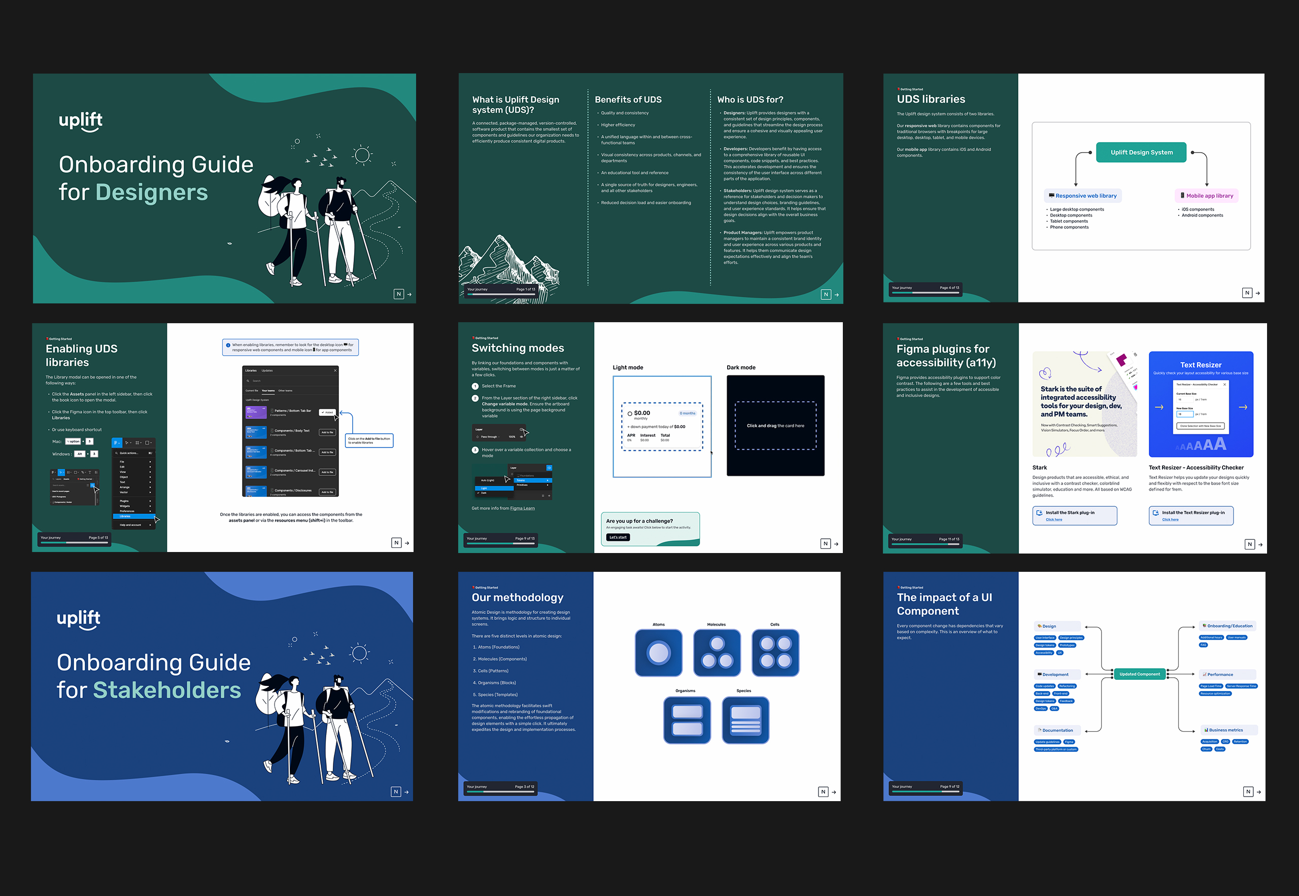
Design System Onboarding
Training and onboarding are critical to the successful adoption of any design system. To support this, I created personalized onboarding guides for designers, engineers, and stakeholders—each tailored to their specific roles, experience levels, and familiarity with Figma and our system.
These guides were accompanied by engaging presentations that clearly outlined the benefits and practical applications of the design system. To make the learning experience more effective and memorable, I also introduced interactive, hands-on activities that allowed team members to apply what they learned directly within Uplift’s design system. This immersive approach helped accelerate understanding and encouraged best practices across disciplines.
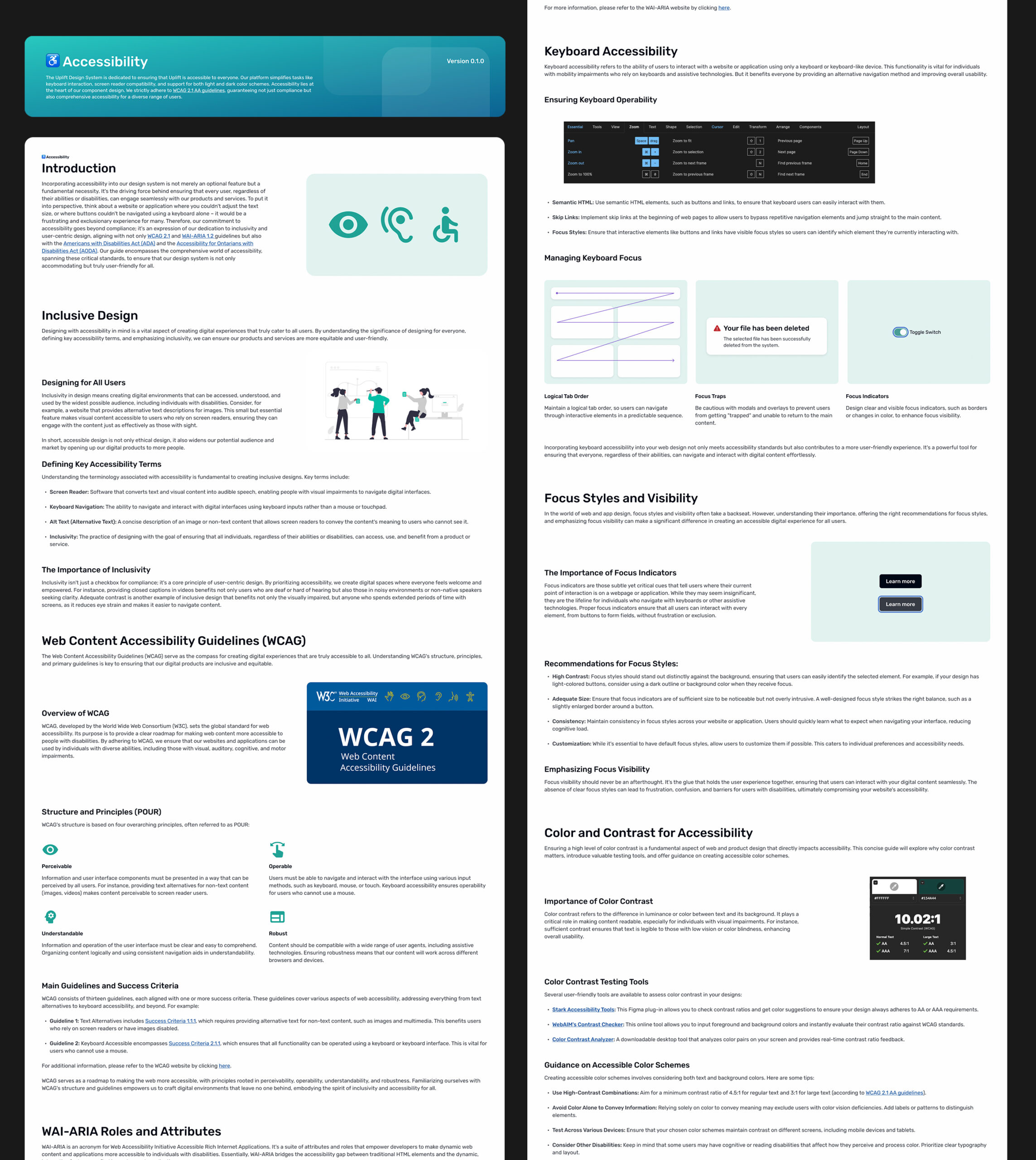
Accessibility
At Uplift, accessibility is a core principle, not an afterthought. The Uplift Design System is built to support a wide range of users by prioritizing features like keyboard navigation, screen reader compatibility, and seamless performance across both light and dark modes.
We design every component with inclusivity in mind, adhering to WCAG 2.1 AA standards to ensure compliance and create a more accessible, equitable experience for everyone—regardless of ability or preference.
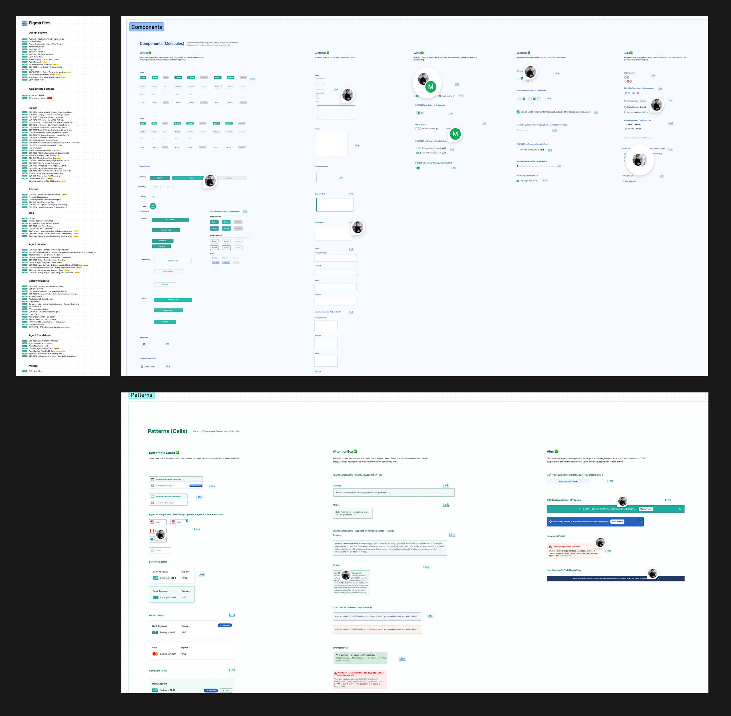
Foundations
Foundations, often called “atoms,” are the building blocks of our user interfaces. They serve as the cornerstone for design consistency and scalability. These foundational elements include key design decisions such as corner radius, breakpoints, color palette, grid systems, shadows, spacing, and typography—all of which shape the visual and functional coherence of our products.
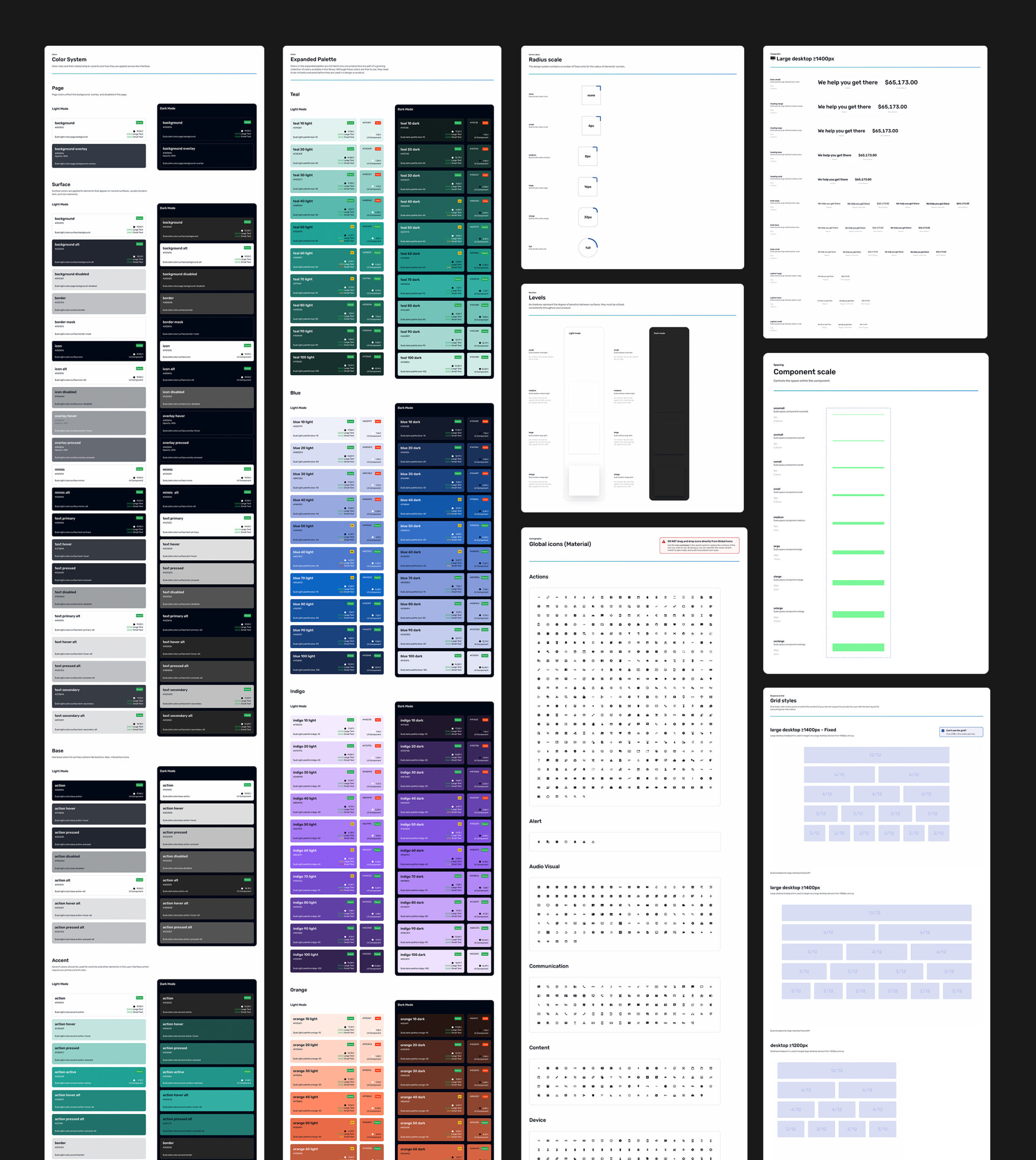
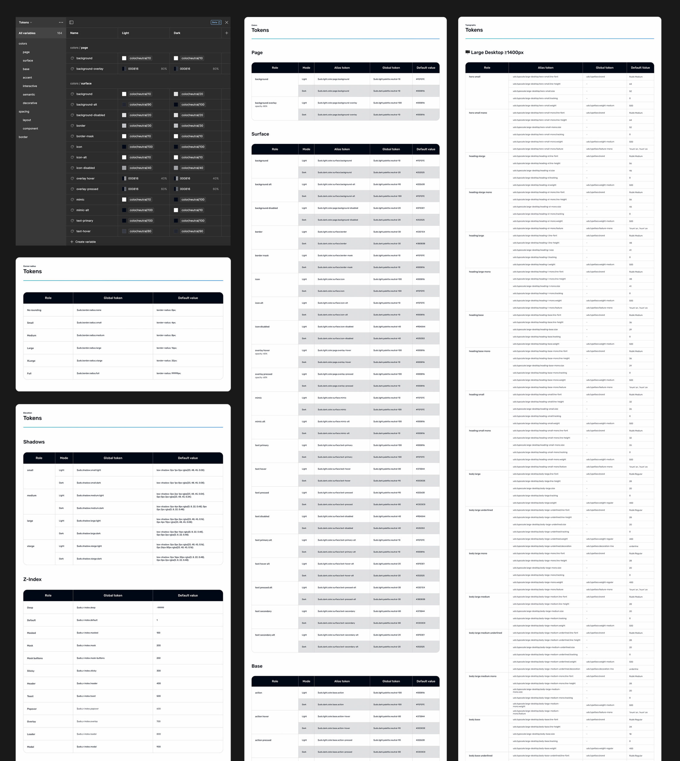
Design Tokens
Design tokens are reusable variables that define core design attributes—such as colors, typography, spacing, and elevation—in a structured, consistent format. They serve as the connector between design and development, ensuring design decisions are implemented accurately across platforms.
By centralizing these values, design tokens make it easier to maintain visual consistency, support theming (like light and dark modes), and scale the design system across products and technologies.
Components & Patterns
After identifying the core components and patterns needed for our pilot product, I prioritized and designed each element with a focus on seamless handoff to the engineering team. This groundwork laid the foundation for broader adoption across our full product ecosystem.
All components were thoughtfully built to support both light and dark modes, using Figma’s variables feature to ensure a smooth and consistent experience across visual themes.
To further optimize our system, we adopted a single-file element structure. This approach simplifies maintenance, reduces memory issues often associated with large UI libraries, and enables clear version control and in-file documentation for every component—supporting scalability and long-term system health.
Autolayout & Variants
Figma is one of the most powerful tools for product design and building scalable design systems. To streamline our workflow and improve cross-functional collaboration, I’ve fully leveraged key Figma features such as Auto Layout and Variables. These tools enable designers to create flexible, responsive components, while giving developers direct access to detailed specs, variants, and usage guidelines—ensuring a seamless, efficient handoff from design to development.
Storybook
We implement our design system components in Storybook, which serves as the single source of truth for our developers. Within Storybook, we provide comprehensive documentation, including component usage guidelines, defined properties (props), accessibility testing results, and theme-switching capabilities. This setup ensures that developers and designers alike have access to live, interactive components—and a clear understanding of how they behave in real-world scenarios.
Design Audit and QA
As part of each sprint, I conduct a thorough design audit of all work produced by our team of four product designers. This process ensures consistent use of existing components, flags unintended overrides, identifies design redundancies, and helps maintain visual and functional coherence across the product.
We also place a strong emphasis on maintaining a clean, organized design environment. All files are properly labeled, structured, and linked to the design system—streamlining collaboration and handoff. We leverage Figma’s section status feature to manage file readiness and keep work aligned.
To illustrate the impact of our design system, I’ve included a before-and-after comparison below. The updated version highlights improvements in grid structure, scalability, and accessibility, resulting in a more polished and cohesive user experience.

User testing
At Uplift, user-centricity is at the heart of everything we do. We prioritize real user perspectives over internal assumptions by consistently conducting user testing and gathering direct feedback. These insights allow us to deeply understand user pain points, needs, and motivations.
By identifying issues and uncovering opportunities early, we’re able to make informed, high-impact design decisions that improve usability across our web and app experiences. This approach not only enhances the user experience but also contributes to higher conversion rates and sustainable revenue growth.

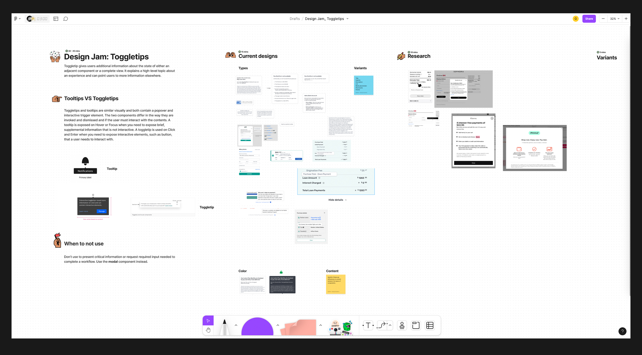
Design Jam
Collaboration is key to driving adoption and demonstrating the value of our design system. To support this, I host regular design jam sessions that bring together designers, engineers, and product managers. These sessions create space for open dialogue and shared decision-making before component design begins.
By aligning early, we ensure that everyone’s perspective is considered—especially how design decisions are shaped by technical functionality. This collaborative approach not only builds awareness but also fosters stronger cross-functional alignment and a more cohesive system overall.
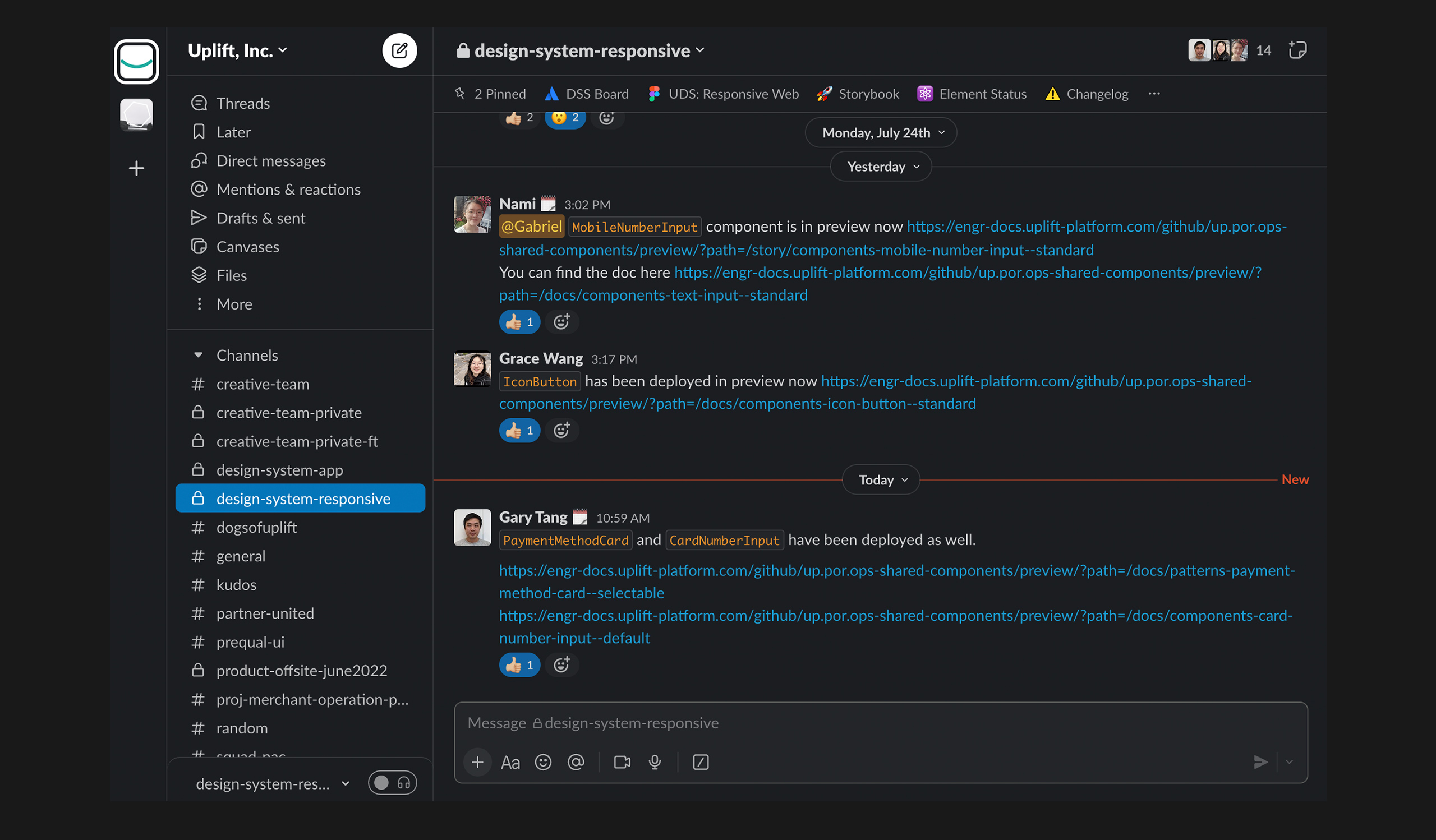
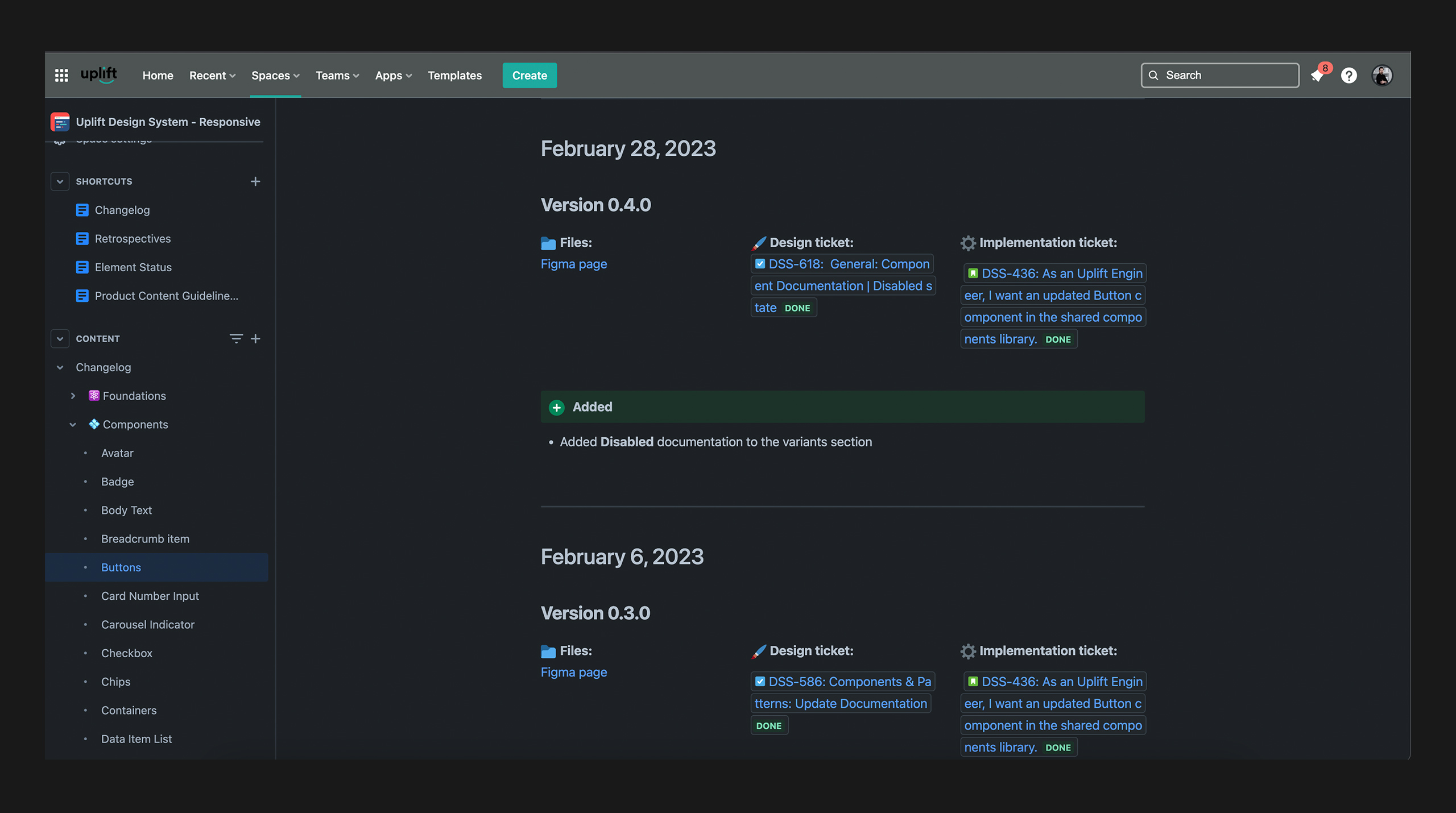
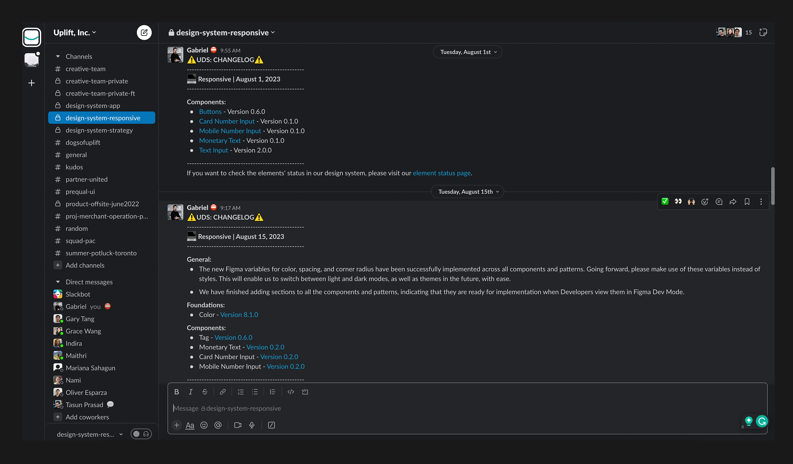
Communicating Updates and Changes
Effective communication is essential to keeping teams aligned and informed about the evolving state of our design system. To support this, I regularly share updates via Slack, along with links to a detailed Changelog on Confluence, ensuring transparency around changes and additions.
I also maintain up-to-date status tracking for all design elements, giving stakeholders clear visibility into component readiness and availability.
In addition, I host bi-weekly Design System Office Hours every Tuesday afternoon. These sessions offer a dedicated space to showcase new components in progress, foster cross-functional understanding of design system principles, and address any questions or feedback.
This proactive communication strategy ensures both stakeholders and engineering teams stay informed and aligned, enabling smooth collaboration and seamless implementation of design system updates.

Building and maintaining a design system goes far beyond creating a UI library—it's a strategic, cross-functional effort that requires thoughtful planning, clear communication, and strong collaboration across teams.
Design systems are powerful tools for any organization aiming to deliver cohesive, scalable, and accessible user experiences. They serve as the foundation for brand consistency, boost efficiency in both design and development, and ultimately foster trust and satisfaction among users.
I hope this portfolio piece has offered meaningful insight into my role and responsibilities, while also providing practical guidance for those navigating the complexities of design systems. Whether you're building one from scratch or refining an existing system, I hope this content helps clarify your path forward.
Hey! Let’s connect and create something amazing together!
Hey! Let’s make something great together!
Hey! Let’s make something great together!